Assignment 4: Cooking Skills

Overview

Cooking is a skill that contributes to your well-being and to maintain a healthy lifestyle. It is an essential skill in life that can provide to be useful for years to come. Not to mention it also helps save a lot of money.

Lesson Objectives

  • Properly purchasing ingredients required for a steak dinner
  • Washing ingredients before prepping
  • Prepping ingredients by cutting
  • Consistently cutting ingredients the same size
  • The types of steaks that come from a cow
  • Learn the different types of wellness for steaks
  • Cook steak with an accurate wellness every time
  • Plate steak dinner to be appealing 

Read/Watch

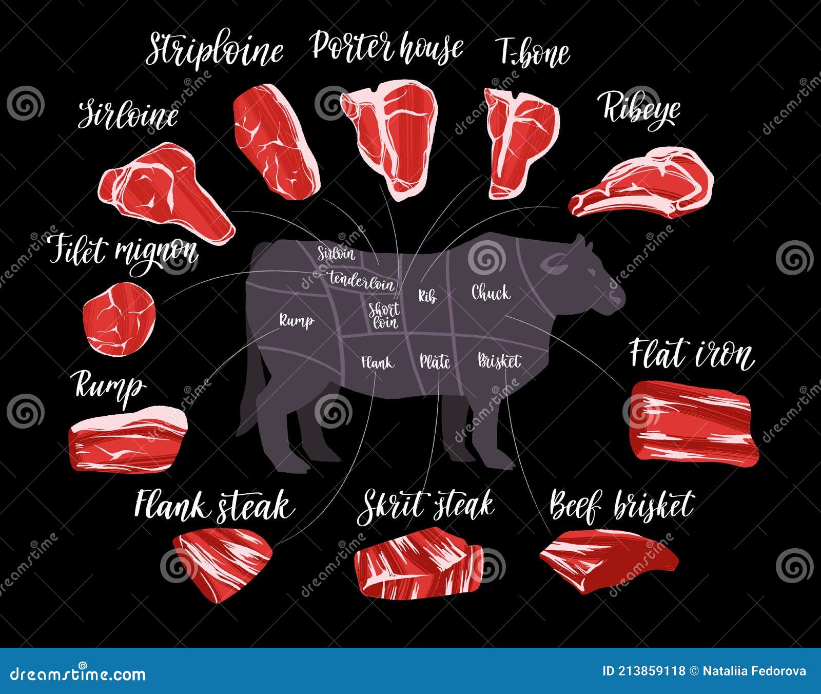
There are many parts of a cow that can be used to cook steaks. The following is for instructional purposes only and will not be quizzed on for the content of this lesson. Everyone has their own personal preference for the types of steak because of its costs, taste, and amount of fat it includes.

Steak Cuts Set. Beef Cuts Chart and Pieces of Beef, Used for Cooking Steak  and Roast. Stock Vector - Illustration of cattle, infographic: 213859118
Types of Steak

Content

Steak Wellness

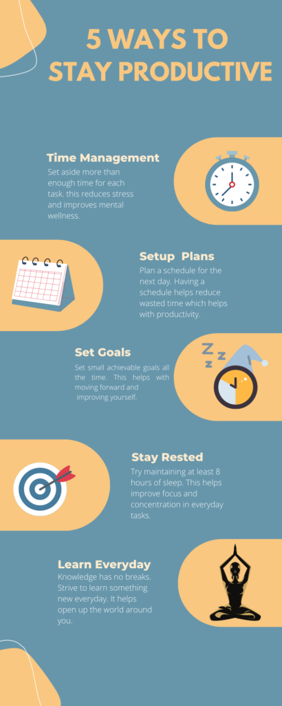
So before we start with the actual process of cooking a steak let us first learn the different types of wellness it can be cooked. After going through the infographic there will be a fill-in-the-blank quiz to grade understanding.

Steak doneness chart Infographic chart of steak doneness: from rare to well done meat. steak doneness stock illustrations
Steak Wellness Infographic

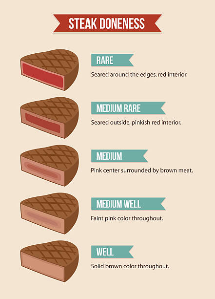
So now that you have successfully completed the fill-in-the-blanks let us move onto ingredients.
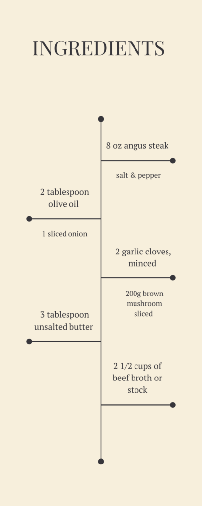
Ingredients

Please prepare these ingredients prior to the actual cooking of the class. Ingredients list are used as organization tools to have to stay organized and to ensure cooking goes as planned.
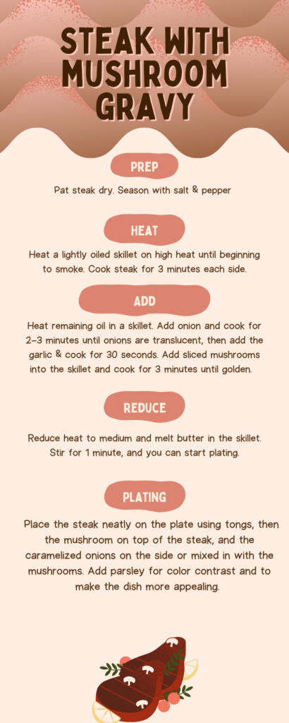
Cooking

Cooking Instructions

Application

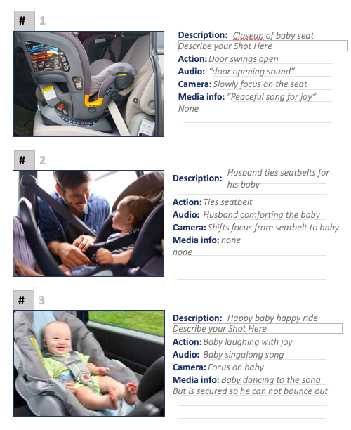
Learners after watching the video will be required to complete an assessment task of cooking a mushroom steak dinner and presenting it. As the presentation suggests, 3 minutes each side of the steak will give a medium rare wellness. Please ensure to add or minus 30 seconds each for different steak wellnesses. For example, medium will be 3 minutes and 30 seconds.

Please ensure to have understood the video before starting your attempt (Steaks are not cheap!).

The following rubric will be used to grade the final product. It will be graded on accuracy of steak wellness in this case every steak must be cooked medium rare as it is the most popular wellness there is. In addition, also aesthetics of how the plating is when the final product is complete.

Rating/GradeCharacteristics
Grade Exemplary The presenter is well prepared and organized in presenting. All food
is perfectly cooked, presentation surpasses expectations, and
recipients is kept exceptionally comfortable throughout the meal.
Grade SatisfactoryThe presentor is prepared in presenting. Food is cooked correctly,
the meal is presented in a clean and well-organized manner, and
the recipient is kept comfortable throughout the meal.
Grade EmergingThe presenter is sometimes not that cleared and prepared in
presenting. Some food is cooked poorly, some aspects of
presentation are sloppy or unclean, or the recipient is
uncomfortable at times.
Grade UnacceptableThe presenter is not organized and prepared in presenting. Most
of the food is cooked poorly, the presentation is sloppy or unclean,
and the recipient is uncomfortable most of the time.

Reflection

Based on the steak wellness chart how far away were you from cooking a perfect medium rare steak? Did you char the onions before they became caramelized? Were the mushrooms cut perfectly similar in thickness and size?

Theories and Principles

We tried to remove any useless information or repetitive information by incorporating the redundancy principle to keep the blog on point. We moved forward by acknowledging the coherence principle which goes from one step to another to eep things organized. Both these steps together were used to help reduce any extraneous cognitive load that might occur by giving too much information all at once. We also used the signalling principle when we added headers to signal ingredients, cooking, etc. to show what step we were on. The dual coding theory was also put into consideration when we used videos, text, pictures to help the learner absorb more information.

References

https://www.canva.com/

https://www.dreamstime.com/steak-cuts-set-beef-chart-pieces-used-cooking-roast-vector-hand-drawn-flat-illustration-lettering-butcher-shop-image213859118

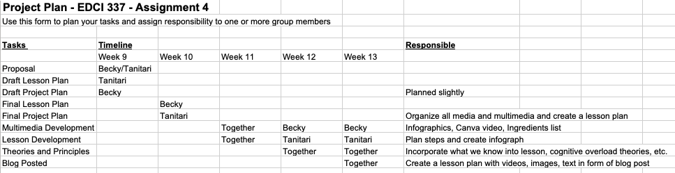
Also Project Plan is added here because there is no way to add a file submission.

Weekly Blog 8

How have you found the balance of passive and active learning in this course for your learning? How does it compare to your experience in other courses?

I found out the method I prefer to learn is first using passive learning and memorizing terminology of the course in order to gain a better foundation to start using active learning. I am able to engage more in active learning when I feel comfortable with my first level of understanding of the course. I think although active learning is more important than passive learning, without passive learning I become overwhelmed with information and tasks are very hard for me. I become extremely frustrated until I am in a comfortable place. The organization of this course helps put all terminology in each weeks reading and then we are asked to use active learning by involving ourselves in using say H5P for this week and other activities like Canva to incorporate what we have learned to design a better learning design. I now understand why some teachers teach better. It is how to channel the information from them to us by using a well design with good principles and theories used.

What was your experience of trying out H5P? Which of the activities do you think you would make most use of in your teaching context and what would you use them to do? Which ones do you think require the most resources to create?

I created a Drag the Words to help with learning terminology and to have a basic understanding of what we learned this week. I think activities that involve adding images, and sound would cost the most time to make. The more complicated the H5P the longer and more resources it requires to create. I also believe the more resources used to create an H5P would also mean more information being communicated towards learners. The one I used is fairly simple so that means it is fairly easy and considered to be an easy task.

Core Multimedia Skills

Edited version of Multimedia Object
First version of Multimedia Object
  • A short explanation of the goal of your multimedia learning object. What are you hoping people learn?
  • Productiveness is never taught in school but always encouraged. There is only so much time in a day to get things done. I think being aware of productiveness and the usefulness of it would help benefit everyone. It does not have to be a super strict schedule everyday but to have some form of organization for your time helps properly managing it.

  • A description of why you updated or changed specific elements of the multimedia learning object, and why the updated object is now more effective at increasing knowledge transfer based on multimedia learning principles and related learning theories.
  • With the cognitive load theory in mind, I reduced text length and tried to state the point with fewer words. A lot of people only read an infographic once or twice so it is important to have them absorb all the information first read without overwhelming them. I also optimize my colour use by adding a warm mustard yellow colour to create a comfortable contrast in the design. I changed the headers to have only two words to show “repetition” and to maintain a hierarchy by the different text sizes to show the importance of the steps. Balance, color, alignment were also my main focuses and I believed the newer design shows an improvement compared to the first one in terms of that.

  • Feel free to point out any elements of the multimedia learning object that you did NOT upgrade, because you felt they were already effective based on multimedia learning principles and related learning theories. 
  • I felt that although some of the text needed to be changed in order to reflect on HOW each step helped in becoming more productive the headers stayed simple and the same. Although I did change all the headers to contain ONLY two words. With the cognitive load theory in mind I only represented one idea per step in order to help absorb the information without the student being overwhelmed. I also used the signalling principle in the design to show the most important information first where the title is followed by the 5 headers which point out the main ideas with text to help explain the headers. I also incorporated the coherence principle where all the ideas were coherence with one another by sharing the common idea of “time” and how to properly cooperate with it.

References

Johnson, D. (2021, February 19). Design and Layout with Canva [Mp4]. https://www.youtube.com/watch?v=g3pdyid7BjU

McCue, R. (2021, February 20). Introduction to Infographics with Canva & Related Multimedia Learning Principles [MP4]. https://www.youtube.com/watch?v=K1k3deWbw2c

Weekly Blog 7

Students â€“ Can the students access the media you created or use the technology required? For example, a paid version of Photoshop, Microsoft word, a paid subscription to use the content needed by the instructor. 

Ease of Use – Is it hard to create? Similarly, I found Canva very user friendly when we can edit the already created templates. However, it was nearly impossible for me to create an infograph from scratch and for it to look appealing with little to no experience. It takes a lot of practice, skills, and experience to get good with Canva. Repetition does make perfection.

Cost

There is a cost in all aspects of using a service or a good. It could be your time (watching ads), privacy (sharing personal information to a 3rd party), and money (the original medium of exchange). With many competitions in the technology field, costs have significantly lowered from what it was before. However, since the costs have lowered, other substitutions are used like your time and privacy. Just how costly would it get?

Teaching 

How does the media or multimedia support what the teacher is teaching? I think personally, a media or multimedia to support teaching would be one that acts as an extension of what the teacher is lecturing about. Similarly, like when a lecture is going on and a student is trying to remember the information the teacher throws at them. The perfect media would be an animated infographic of the content to help students organize the material.

Interaction 

Interaction is an important part. It helps to get students involved. So the tool used must be beneficial in helping the student and the content grow a stronger connection. But how to measure the efficiency of it is harder than normal. 

Organization 

How much the school is supporting the technology required to access your media? For example, you are using a drawing application to teach students to draw. You would need iPads to download the application for each student which would rise the costs substantially. 

Networking

Can you network with this medium being used? Mattermost and edtech helped networking possible between students without having the need to add them. EdTech is a blog where everyone can access and mattermost is used as a forum similar to discord. It helps students able to efficiently share ideas and to connect. Privacy risks are brought up to the student’s attention during registration of the site from the very start. Which brings awareness to the risks imposed.

Security

Privacy is only as important as how serious it is being taken. Personal information sometimes isn’t taken seriously enough online. Like information needed to register an account should not be revealed in some cases to keep at least some level of privacy. Just how much privacy would be needed?

Weekly Blog 6

  • Describe six promising practices for creating a meaningful story.
    • Immerse your audience in a story. Make your audience really feel like they are in the story as well an reliving it as you tell it. Using visual and sensory details that will bring a deeper connection with audience is important. 
    • Tell a personal story. Tell something that relates more to you and something personal to show that you and the story have a deep connection 
    • Create suspense. Make the audience eager to reach the end of the story. Leave unanswered questions in the story that are slowly unraveled. Leave out important details of the story that requires explaining later on. The urge to know and not be left in the unknown is what makes audience strive for more. 
    • Bring characters to life. The characters in the story need to be alive. They need to be not just a really boring character to help with moving the story along. Instead it should be a dynamic character that grows with the story and has a life of its own in the story. 
    • Show. Don’t Tell. Instead of just telling a story try to show it. This also helps add onto immersing your audience to the story. How do you show? Well, you can show a story by describing more verbally and using more pictures to help really have the audience imagine themselves in the story. 
  • End with a positive takeaway. I think this one hits the strongest. A positive takeway is like a resolution at the end of the story. The story starts with a problem and the audience immerses in it living out the problem as it they are inside the story as well. They wish for a positive takeaway (problem-solved) because the problem is now their problem as well. Which is why a majority of people do not really like cliff hangers, or the evil person wins stories as much. 

In the reading this week, 7 Storytelling Techniques Used by the Most Inspiring TED Presenters, which of the presenters did you find most compelling? What technique(s) did you recognize in their talk?

Leslie Morgein Steiner’s talk on abusive relationships and domestic violence was the most compelling to me. When she told her personal story she showed a lot of energy and power in her words and gestures that help immerse audiences into the story. The choice of descriptive words and subtle suspense she creates also help keep audiences on the edge of their seats. The best part was when she says “the ten black bruises on my neck” while using her two hand to imitate a choke with her hands showed so much suspense and demonstrates the show don’t tell as well. She properly uses at least 3 of the techniques to make a good story telling experience like create suspense, tell a personal story, and bring characters to life (have the husband slowly become a nightmare). She had so much power with the words she chose to use because of how personal the story was to her and how much it had changed her life. It was her story.

Short video on showing the importance of having a baby seat properly secured.

With little to no experience in writing scripts for a video, here is mine. It is a short video for showing how to properly secure a baby to a carseat to ensure their safety. The use of extra cute babies would be needed to help bring more attention to the video. I used little knowledge I do know to do a closeup of the carseat, a over the shoulder (from the baby’s shoulder to look at the father and how the father would look at the baby (the audience has the perspective of the baby) and to show the father turning around and looking at the baby to help bring audiences closer into the video.

References:

Ferster, Bill (2016-11-15). Sage on the screen : education, media, and how we learn. ISBN 9781421421261. OCLC 965172146.

Weekly Blog 5

Big Idea   
What is the big idea that the learner will walk away with at the end of the lesson that is critical for learners at this stage of their learning path? 
Learning Outcome(s)
What specific things will the learner know or be able to do by the end of the lesson? 
Evidence of Learning
What does learning look like for this objective? (e.g., accurate performance of a task, correct use of terminology)
Assessments
What will learners do to provide evidence of their learning? (e.g., a presentation, a test, a project)
Learning Activities
What learning activities will allow learners to acquire and practice the skills necessary to demonstrate their learning and complete the assessment successfully?
    Solve real-world problems and questions that people have by designing code to solve any problem that arises.     Learn how to write code with proper syntax (grammar) in C++ to run small programs that solve a simple task and/or problem.     Be able to tackle small tasks by properly designing a piece of code to solve the problem given. When given a small problem, the learner is able to use pseudo-code to solve it. The learner is then able to change the pseudo-code into code using proper syntax to create an application that will solve the problem. (i.e. a income tax calculator which takes an input and gives an output)In the form of a short answer question.  Read text that explains terminology Watch videos that explain how different pieces of code does different things Watch videos to put the pieces of code together to do one big thing Put it all together. 
Lesson Design Planning Template for Writing Code in C++

The following template was planned to use backwards design. It starts with what the learning outcomes are. Then it is continued by how we assess or test that the learner has enough knowledge to apply what they know into solving the problem in the form of a test or project. Then this follows with the activities needed to teach the learners about the outcomes in the form of watching videos or reading text or engaging in labs.

What authentic problem would you use to design a lesson using Merrill’s principles? What media or multimedia (interactive or not) would you create to support it?

I would design a lesson on an introduction to coding lesson using Merrill’s principles. Why? I believe a lot of the free coding courses online have demonstrated that they use the backwards design to help learners learn a completely new language (coding) by making it super easy to absorb the information. For media, I would create videos to teach the concepts and to demonstrate how to write code in a proper way by relating grammar with syntax. This helps learners use their pre-existing knowledge of the English language as a foundation for learning the coding language. Then I would use screen casting to have learners follow along with the problem so they can solve it along. I would give them a problem like make a simple user-login page which takes in a username and password. Then I would choose to give a problem for them to solve by the next lesson (gives them time to recall information from the lecture).

Where do you see constructive alignment and backward design used in this course or another course you are taking/have taken? Is there anywhere where it seems to be missing?

A lot of economics courses, and coding courses seem to use constructive alignment and backward design to construct their course. EDCI 337 no doubt uses these two concepts to design the course as well. However, a lot of university level English course seem to be missing this. For example, they make the presumption that we all know how to properly write at the academic level and that we need to only keep writing to improve. Very little knowledge is taught in university to help add on to preexisting knowledge. Backwards design might have been used to help prepare for the final by having students practice by writing. But compared to other courses I believe limited constructive alignment is used.

References

Kurt, S. “Instructional Design Models and Theories,” in Educational Technology, December 9, 2015. Retrieved from https://educationaltechnology.net/instructional-design-models-and-theories/ Dr. Serhat Kurt, Instructional Design Models and Theories. Sept 28, 2022. 

Weekly Blog 4

  • Identify five visual design principles involved in the design of a learning object

  • Alignment is important by having everything in an organized matter the design will be comforting to look at. It’s like going to a friend’s house and finding it filled with garbage, dirty laundry, unwashed dishes lying around everywhere as opposed to a very clean house. Which would you prefer?

  • Hierarchy comes after because you need to put focus on the most important elements in the design. This kind of comes in line with having different size headers for title, topics, sub-topics, and text. If everything was the same size how would you differentiate the difference between the information displayed?

  • Repetition I think is the most important if you have other design principles down. It helps with having a unique style for your designs that others will react “oh it is Becky’s classic design” It helps reach out and stay in the minds of those who uses or watch your designs.

  • Proximity in my way of understanding it helps decluster designs with multiple elements by organizing them into a small cluster. Sort of like an organized cluster.

  • Negative Space from my understanding is important to have when you are designing. It is the ability to leave an image or area blank that brings more attention to where you put your text. It has an effect of shifting focus to where the important information is.
Productivity Infographic 2022.
  • Which design principles did you use to create your infographic in Canva? Which elements of a ‘good infographic’ were you able to incorporate? What other principles did you consider?

I tried to create a new infographic from scratch, however, with little to no experience it was nearly impossible. I decided to take a template and to edit it with the design principles in mind. The image above I have used alignment and hierarchy to have a set a heading for each of the 5 steps along with short text to go more in-depth of the headings. Alignment for the text helps make it more organized and smoother to read which helps with absorbing the information better. I also applied signalling principle by adding headings to the 5 points as opposed to the original template which did not contain headings. Although I did not use the contiguity principle, I did notice it at work when the original creator organized the picture right beside the text to demonstrate they are all correlated. I did try to consider contrast with colors but with no experience it did not work out. It is a lot easier to read about design than to actually design something.

References:

McCue, R. (2021, February 20). Introduction to Infographics with Canva & Related Multimedia Learning Principles [MP4]. https://www.youtube.com/watch?v=K1k3deWbw2c

Johnson, D. (2021, February 19). Design and Layout with Canva [Mp4]. https://www.youtube.com/watch?v=g3pdyid7BjU

Weekly Blog 3

What did you find when you ran the WAVE accessibility report on your blog post(s)? What did you expect and what was surprising? Is there anything you will do differently going forward? 

The WAVE accessibility report was not at all what I expected. It did a check on my blog in about 3 seconds and detailed all the structures, features, errors, and alerts that it has. It also checks text size and contrast ratio to make sure everything is visually acceptable and easy to follow for the readers. The report was a lot more detailed than I thought it would be. Going forward, I will remember to use a larger header for titles as compared to the paragraph bodies so it can be distinguished easier. It is still amazing to me how much technology has advanced to be able to calculate such a detailed report in such a short amount of time. 

Have you used Text to Speech tools before? Did you find it useful? Did you try out some of the different voices? What impact did the different voices have on your ability to absorb information?

Having never used Text to Speech tools before I was amazed at how the Read Aloud App extension can extract the text so fast from the webpage and read it out. I have tested about 10 different voices from the options page which consisted of many different languages speaking bots with different accents. The different voices with stronger accents were harder to understand than the ones with little to no accents. I do believe that having an accent I am more familiar with, in this case, a western accent helps me absorb information better. Having many different accent options helps for a more inclusive design for the Text to Speech add on. It helps recognize exclusion for those that have visual impairment, solve for one, extend to many by making it compatible for multiple languages, and even learn from diversity by adding so many different voices to accommodate users from across the world. 

What role do you think media and multimedia can play in a learning environment designed with UDL guidelines in mind? Which of the promising practices for text, images and video are in alignment with these guidelines?

I think that media and multimedia can help in a learning environment by playing the role of representation where it offers information in more than just text by having a video, or screen cast to have students follow along. It can also have students increase their engagement similar to when watching Khan academy videos, we follow along with the examples to gain a further understanding of the concepts. Adding closed captions in videos give the audience more than one way to absorb the information (reading and listening). Another one would be having the option to choose playback speed on videos which help with the action and expression by having students engage with the material at their own comfortable pace 

What does inclusive design mean to you?

I think inclusive design means to have one solution to solve the problem for a billion people. This means that the design accommodates everyone around the world (diversity) and also to all the disabilities that affect learning. It means to put into consideration all possible problems that may arise that can bring hardships to learning and solving it. 

References:

Gernsbacher MA.(2015)  Video Captions Benefit Everyone. Policy Insights Behav Brain Sci. 2015 Oct;2(1):195-202. doi: 10.1177/2372732215602130. Epub 2015 Oct 1. PMID: 28066803; PMCID: PMC5214590.

Holmes, K. (2020). Mismatch: How inclusion shapes design. MIT Press.

Inclusive Design (2018) Microsoft Design Principles 

Weekly Blog 2

Of the 3 principles of Mayer’s Cognitive Theory of Multimedia Learning we looked at this week, active processing stood out the most to me. An example is when we read our textbooks for a course we do not consume all of the information but instead filter what is not important out, selecting the information that is essential in learning the objectives, organizing it into subgroups to remember itand integrating thatinformation to be recalled when needed and applied. 

Paivo’s Dual Coding Theory surprised me when it suggests that language and verbal information is not learned together with images but instead two different systems. This seems true when I tried watching a video on redundancy principle as opposed to reading it from Mayer’s â€œPrinciples for Reducing Extraneous Processing in Multimedia Learning, from The Cambridge Handbook of Multimedia Learning”. The 3-minute video helped process the information by already applying the Active Processing of the information from the text which takes substantially longer to read in order help students consume the information faster. However, will this in the long-term hinder the student’s ability to actively process information themselves when they are required to read text and not given the alternative of watching a summarized video?

All the reading/watch resources helped exemplify the extraneous load example by reducing the amount of information the audience consumes by having a short 2-minute video explain with both pictures, text and verbally of the four principles which helped reduce any unwanted information to be consumed. But again the question rises, will watching videos instead of reading text eventually cause a student to lose the ability to actively process information themselves?

References:

Mayer, R. E., & Fiorella, L. (2014). Principles for reducing extraneous processing in multimedia learning: Coherence, signaling, redundancy, spatial contiguity, and temporal contiguity. In R.E. Mayer (Ed.), The Cambridge handbook of multimedia learning (pp. 279-315). New York, NY: Cambridge University Press.

Weekly Blog 1

I decided to attend EDCI337 because I am very interested in learning how to properly setup a blog site because it is really interesting to me. I am not extremely tech savvy so I am excited to use this course to move forward in what I currently am comfortable with. My learning goal is to setup a blog which represents an extension of myself by setting it up as something similar to my own style.

The following are examples of Multimedia, Interactive Media, and Interactive Multimedia, respectively:

Multimedia: Television

Television is a multimedia which does not take input to change its output it just shows the television show.

Interactive Multimedia: Video Game

Videogames like Nintendo switch is a interactive multimedia video game because of its input form user using the controller

Interactive Multimedia: PokemonGO Augmented Reality

Interactive multimedia is pokemongo because it uses augmented reality to change the video on the output while the user move.

I think interactive media is the most interesting to me because of its simplicity while using input (like telling it to move left or right or jump to affect output (having it move the person on the screen)

Its engaging because different inputs could affect the outputs of the media with millions of possibilities. Interactive Multimedia is interesting to me too but because I have far too little knowledge of augmented reality I do not really understand it at this point.