Category: edci337–blog

Weekly Blog 4

  • Identify five visual design principles involved in the design of a learning object

  • Alignment is important by having everything in an organized matter the design will be comforting to look at. It’s like going to a friend’s house and finding it filled with garbage, dirty laundry, unwashed dishes lying around everywhere as opposed to a very clean house. Which would you prefer?

  • Hierarchy comes after because you need to put focus on the most important elements in the design. This kind of comes in line with having different size headers for title, topics, sub-topics, and text. If everything was the same size how would you differentiate the difference between the information displayed?

  • Repetition I think is the most important if you have other design principles down. It helps with having a unique style for your designs that others will react “oh it is Becky’s classic design” It helps reach out and stay in the minds of those who uses or watch your designs.

  • Proximity in my way of understanding it helps decluster designs with multiple elements by organizing them into a small cluster. Sort of like an organized cluster.

  • Negative Space from my understanding is important to have when you are designing. It is the ability to leave an image or area blank that brings more attention to where you put your text. It has an effect of shifting focus to where the important information is.
Productivity Infographic 2022.
  • Which design principles did you use to create your infographic in Canva? Which elements of a ‘good infographic’ were you able to incorporate? What other principles did you consider?

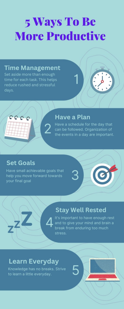
I tried to create a new infographic from scratch, however, with little to no experience it was nearly impossible. I decided to take a template and to edit it with the design principles in mind. The image above I have used alignment and hierarchy to have a set a heading for each of the 5 steps along with short text to go more in-depth of the headings. Alignment for the text helps make it more organized and smoother to read which helps with absorbing the information better. I also applied signalling principle by adding headings to the 5 points as opposed to the original template which did not contain headings. Although I did not use the contiguity principle, I did notice it at work when the original creator organized the picture right beside the text to demonstrate they are all correlated. I did try to consider contrast with colors but with no experience it did not work out. It is a lot easier to read about design than to actually design something.

References:

McCue, R. (2021, February 20). Introduction to Infographics with Canva & Related Multimedia Learning Principles [MP4]. https://www.youtube.com/watch?v=K1k3deWbw2c

Johnson, D. (2021, February 19). Design and Layout with Canva [Mp4]. https://www.youtube.com/watch?v=g3pdyid7BjU

Weekly Blog 3

What did you find when you ran the WAVE accessibility report on your blog post(s)? What did you expect and what was surprising? Is there anything you will do differently going forward? 

The WAVE accessibility report was not at all what I expected. It did a check on my blog in about 3 seconds and detailed all the structures, features, errors, and alerts that it has. It also checks text size and contrast ratio to make sure everything is visually acceptable and easy to follow for the readers. The report was a lot more detailed than I thought it would be. Going forward, I will remember to use a larger header for titles as compared to the paragraph bodies so it can be distinguished easier. It is still amazing to me how much technology has advanced to be able to calculate such a detailed report in such a short amount of time. 

Have you used Text to Speech tools before? Did you find it useful? Did you try out some of the different voices? What impact did the different voices have on your ability to absorb information?

Having never used Text to Speech tools before I was amazed at how the Read Aloud App extension can extract the text so fast from the webpage and read it out. I have tested about 10 different voices from the options page which consisted of many different languages speaking bots with different accents. The different voices with stronger accents were harder to understand than the ones with little to no accents. I do believe that having an accent I am more familiar with, in this case, a western accent helps me absorb information better. Having many different accent options helps for a more inclusive design for the Text to Speech add on. It helps recognize exclusion for those that have visual impairment, solve for one, extend to many by making it compatible for multiple languagesand even learn from diversity by adding so many different voices to accommodate users from across the world. 

What role do you think media and multimedia can play in a learning environment designed with UDL guidelines in mind? Which of the promising practices for text, images and video are in alignment with these guidelines?

I think that media and multimedia can help in a learning environment by playing the role of representation where it offers information in more than just text by having a video, or screen cast to have students follow along. It can also have students increase their engagement similar to when watching Khan academy videos, we follow along with the examples to gain a further understanding of the concepts. Adding closed captions in videos give the audience more than one way to absorb the information (reading and listening). Another one would be having the option to choose playback speed on videos which help with the action and expression by having students engage with the material at their own comfortable pace 

What does inclusive design mean to you?

I think inclusive design means to have one solution to solve the problem for a billion people. This means that the design accommodates everyone around the world (diversity) and also to all the disabilities that affect learning. It means to put into consideration all possible problems that may arise that can bring hardships to learning and solving it. 

References:

Gernsbacher MA.(2015)  Video Captions Benefit Everyone. Policy Insights Behav Brain Sci. 2015 Oct;2(1):195-202. doi: 10.1177/2372732215602130. Epub 2015 Oct 1. PMID: 28066803; PMCID: PMC5214590.

Holmes, K. (2020). Mismatch: How inclusion shapes design. MIT Press.

Inclusive Design (2018) Microsoft Design Principles 

Weekly Blog 1

I decided to attend EDCI337 because I am very interested in learning how to properly setup a blog site because it is really interesting to me. I am not extremely tech savvy so I am excited to use this course to move forward in what I currently am comfortable with. My learning goal is to setup a blog which represents an extension of myself by setting it up as something similar to my own style.

The following are examples of Multimedia, Interactive Media, and Interactive Multimedia, respectively:

Multimedia: Television

Television is a multimedia which does not take input to change its output it just shows the television show.

Interactive Multimedia: Video Game

Videogames like Nintendo switch is a interactive multimedia video game because of its input form user using the controller

Interactive Multimedia: PokemonGO Augmented Reality

Interactive multimedia is pokemongo because it uses augmented reality to change the video on the output while the user move.

I think interactive media is the most interesting to me because of its simplicity while using input (like telling it to move left or right or jump to affect output (having it move the person on the screen)

Its engaging because different inputs could affect the outputs of the media with millions of possibilities. Interactive Multimedia is interesting to me too but because I have far too little knowledge of augmented reality I do not really understand it at this point.